
2022
Trumf
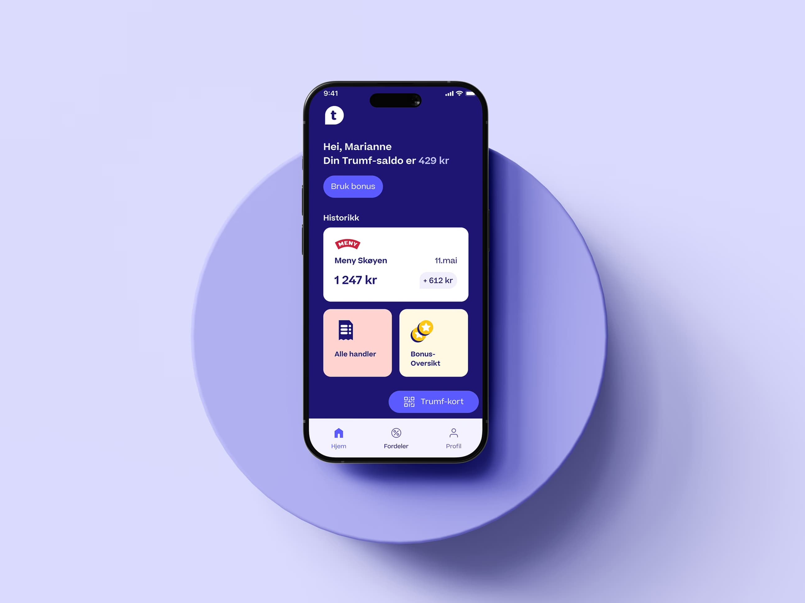
Trumf offers its members a broad range of digital utility services, designed to help them make better choices in everyday life.
The battle for consumers now happens in real time — on mobile, in-app, across every channel. Today's customers expect tailored experiences, relevant benefits and seamless technology, all in one place. For Trumf, it's no longer just about bonus points — it's about being a relevant part of members' everyday lives.
My role
I've been part of two teams at Trumf:
Trumf ID: Core functionality for secure ID and sign-in — the foundation of the entire Trumf experience across NorgesGruppen's brands.
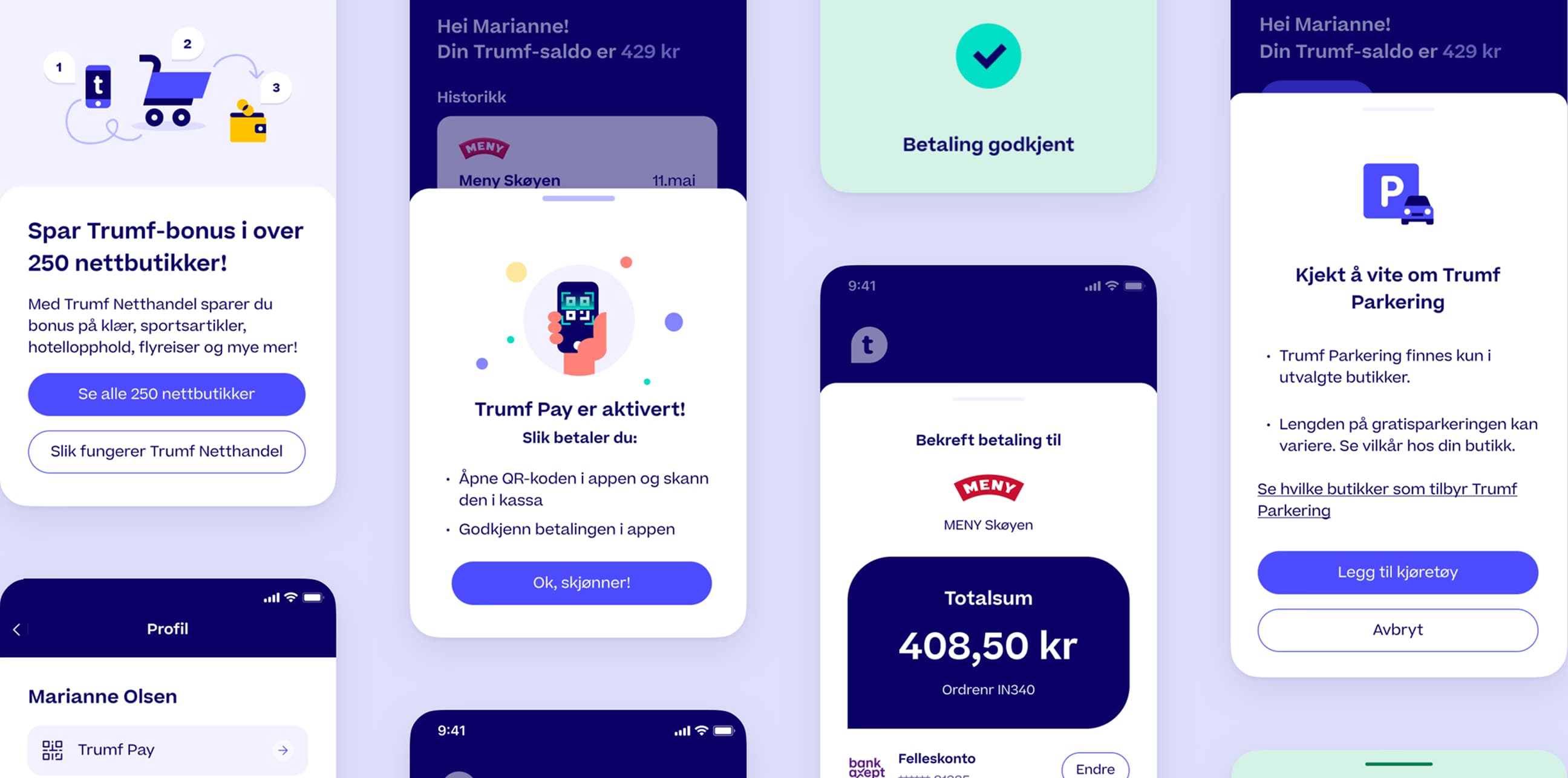
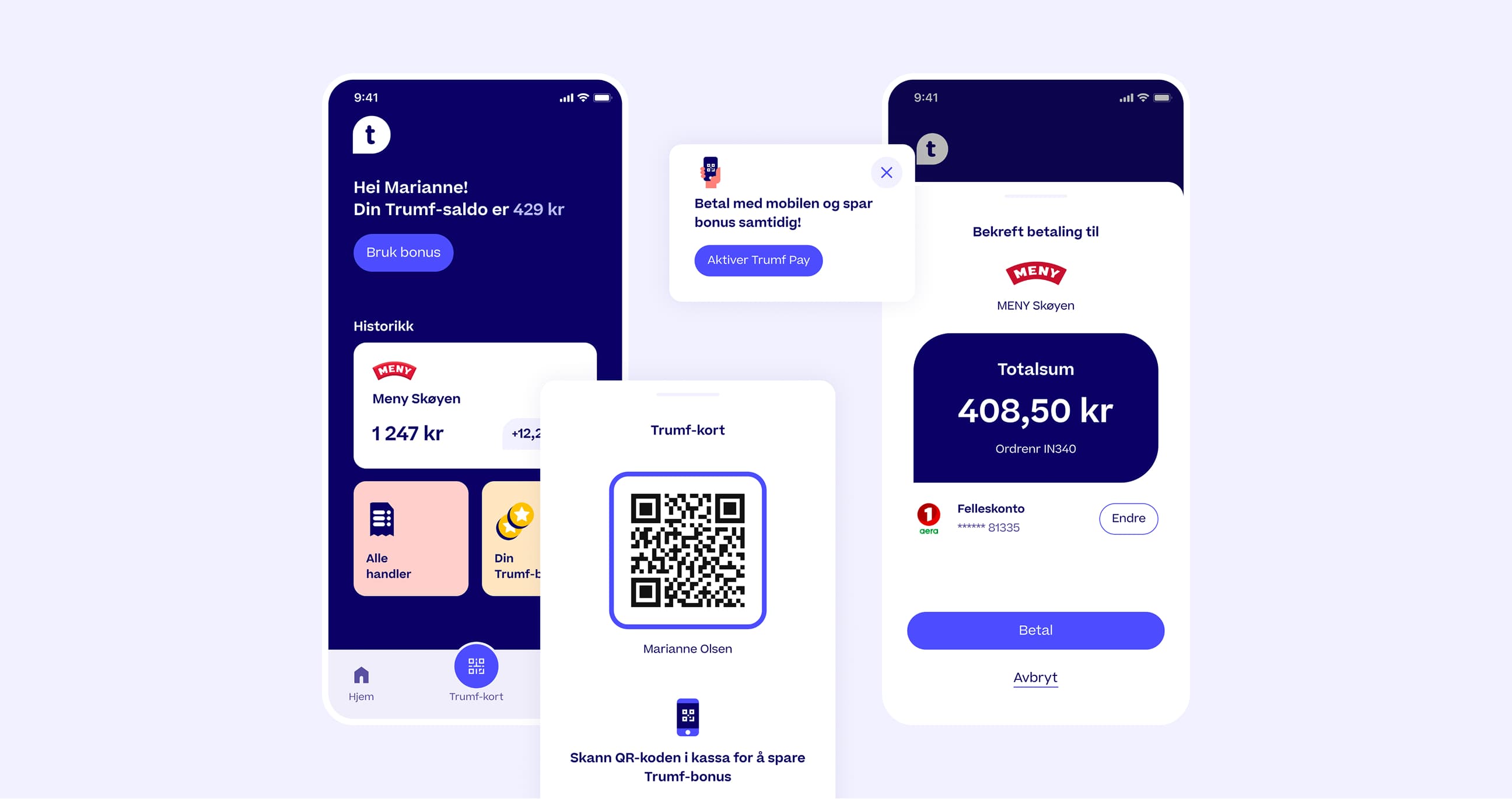
Trumf Pay: One of the newest initiatives is Trumf Pay, a mobile payment solution built into the app. Today Trumf Pay accounts for over 20% of all mobile payments in the loyalty programme — and the share is growing fast.
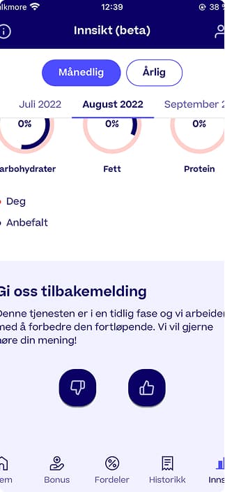
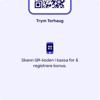

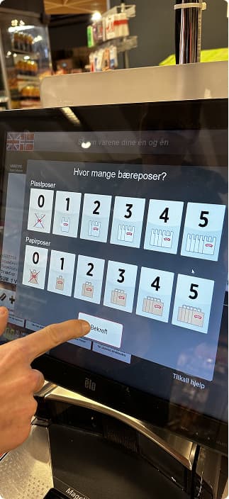
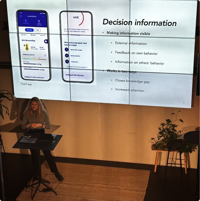
Example project
Onboarding flow – Trumf Pay
Challenge
Trumf wanted a clear, well-structured onboarding for the new Trumf Pay concept. We had to tell users they needed the right bank, to accept terms, that payment happened account-to-account, and so on. This led to drop-off and confusion during onboarding.
My role
Interaction design and UI. Responsible for structure, UI, microcopy and design guidelines. Designed in Figma, working closely with product, engineering and legal to balance clarity with requirements.
Process
- Mapped critical information needs together with product, tech and legal
- Built a prototype as a starting point
- Interviewed users to understand expectations and thresholds
- Walked through it with the team — design reviews and workshops
- Iterated the design based on feedback and legal changes
Learning along the way
In improving onboarding in the Trumf app, we started from the classic principle that 'fewer clicks means a better experience.' But we quickly learned — through both customer feedback and testing — that this approach weakened users' understanding of what they were actually agreeing to. Fewer steps meant less context and lower trust. So we had to find a balance: how do you ensure clarity and a good experience while still respecting business needs and legal requirements? This project became an exercise in balancing design intuition with real insight from end users — and in accepting that simplicity doesn't always mean fewer steps.
Solution
A new, cohesive onboarding consisting of:
- Simple explanations of account-to-account transfers and security
- A clear check for bank support and connection
- Information about the terms and what the user is agreeing to
- UI animations and small micro-interactions that build flow and trust
Examples of other initiatives I've worked on
A new Trumf ID sign-in flow with biometrics
The transition from a physical to a digital Trumf card, and how it should live in the new app.
Improved purchase button and packaging information: explored alternatives to the "Buy" button and visual cues to distinguish packaging levels.