2023
Aera Payment & Identification
Brought in to help realise Aera's vision of becoming a leading player in web checkout solutions.
Example project
New checkout module
Background
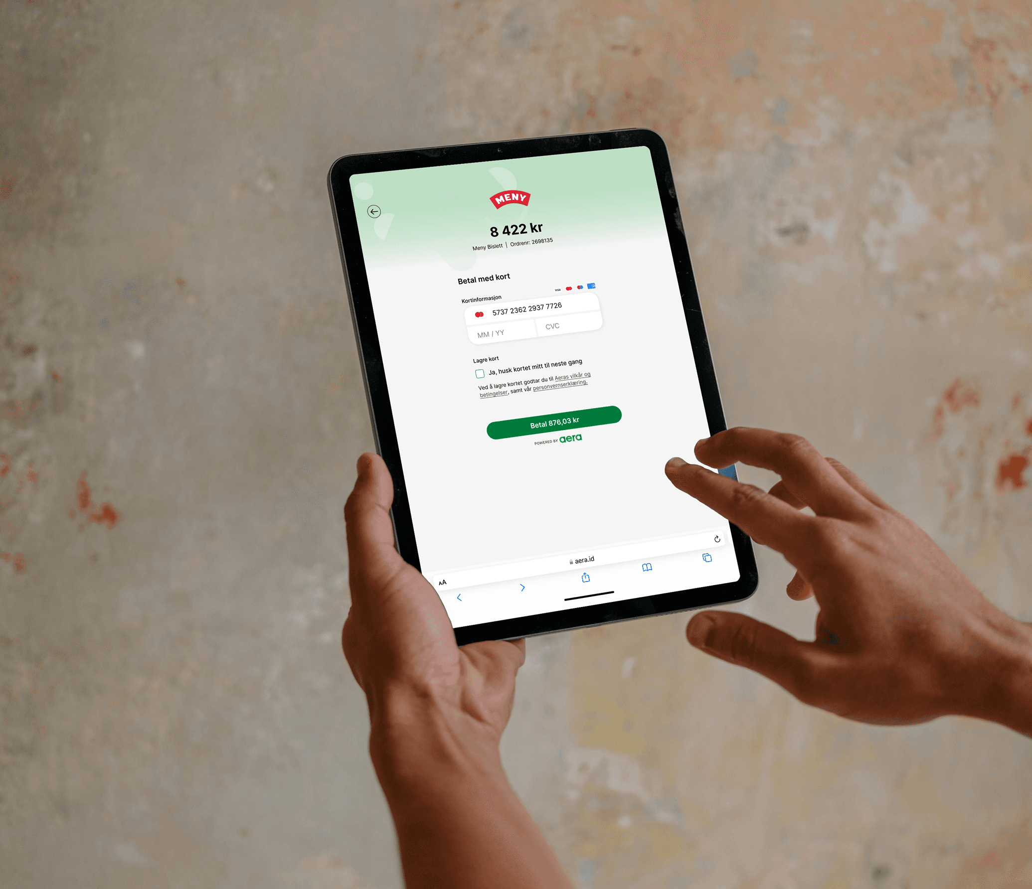
Aera is building a new payment service to better meet customers' need for a unified payment experience. As part of the project, Aera has to modernise many front-end components to stay competitive. The project's main focus is modernising the hosted payment page, an important payment gateway for online retail. It lets webshops accept more payment methods without having to worry about security and compliance.
Goal
The goal is to improve the functionality and user experience of the HPP, making it simpler and more intuitive to use. This should help increase conversion rates for the webshops and strengthen their brand. They want the solution to be a seamless user experience in line with the best market standard.
My role
UX designer and facilitator / team lead for a team of 3 – frontend, graphic design and UX. Responsible for user experience and flow. Facilitated workshops with stakeholders, ran user testing, and shaped wireframes and prototypes.
Process
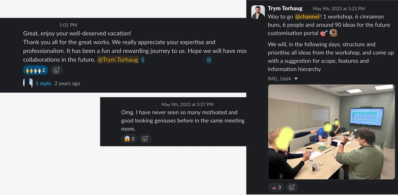
- Client brief and kick-off – a kick-off meeting and workshop with the client to clarify expectations for the project, roles and deliverables. The client had clear constraints and high expectations, so the main focus was creating value quickly and enabling tight iteration.
- Team canvas with the development team – we got to know each other, clarified roles and responsibilities, and established good communication routines for effective collaboration.
- Service design blueprint – we mapped out a technical user journey to chart the flow, dependencies and potential bottlenecks in the solution.
- Design and testing – developed and user-tested early sketches to validate direction and identify friction points early.
- Parallel development – the frontend team started setup and development in parallel with the design process, to keep up momentum.
- Constraints and adjustments – findings from research, along with technical and legal requirements, shaped further design choices and the user experience.
- Ongoing quality assurance – frequent check-ins with the client and project manager to make sure we stayed on track throughout.
- Universal design – systematically tested the solution for accessibility, and adjusted where needed to keep it inclusive.
- Heuristic evaluation – carried out an evaluation based on established heuristics and improved the solution's usability.
- Closing workshop and handover – a final workshop reviewing remaining work, handover to development, and a complete design system for future scaling.
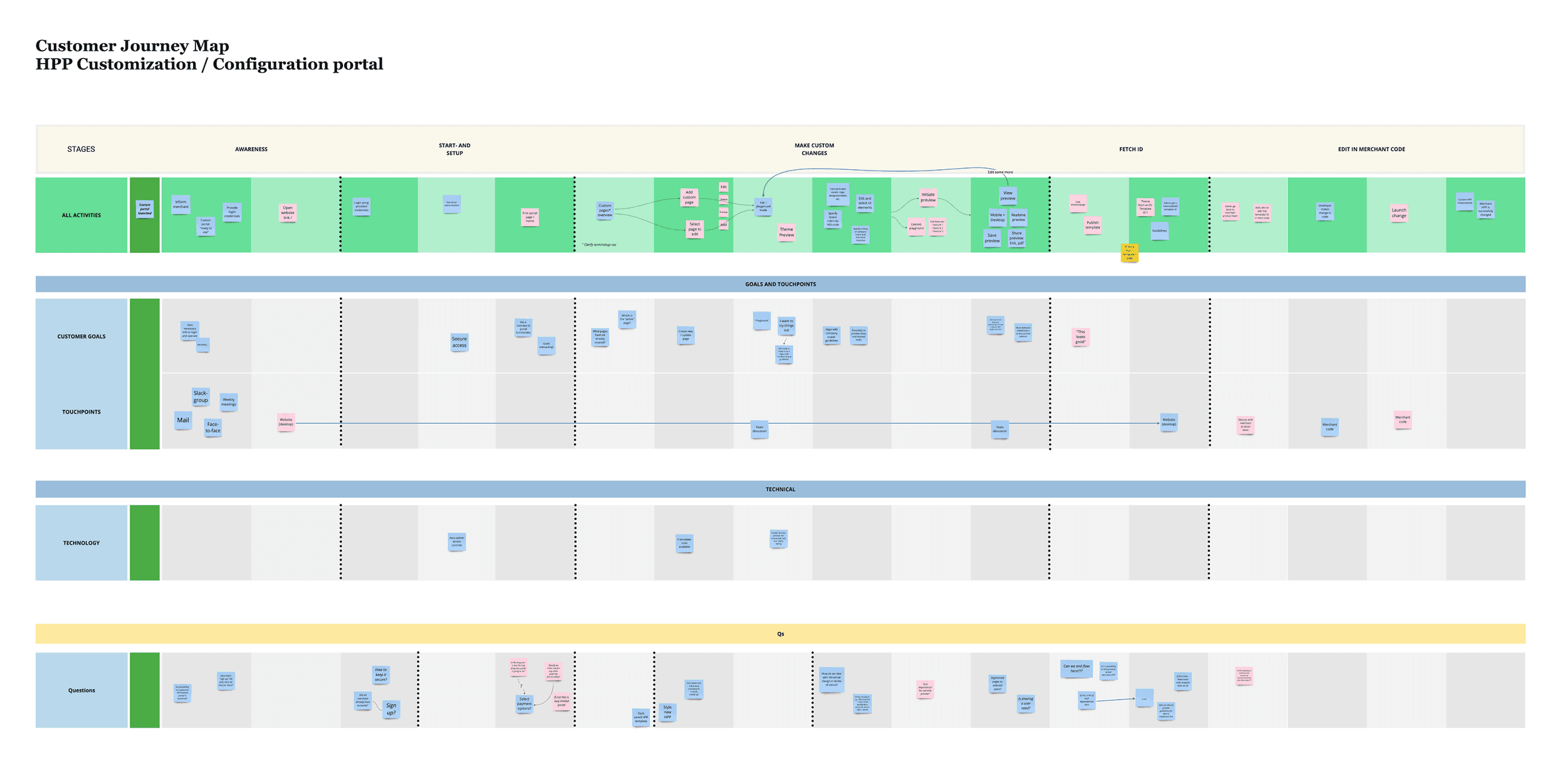
Learning along the way
The project gave me a deeper understanding of complex form design. Building something for everyone takes time and requires iteration and testing. I experienced how demanding it is to reconcile visual simplicity with accessibility and business logic, while the solution still has to work across languages and devices. That complexity is what made the project rewarding. I learned a lot about WCAG requirements, keyboard navigation, and how details in field names and error messages affect the user experience.
Solution
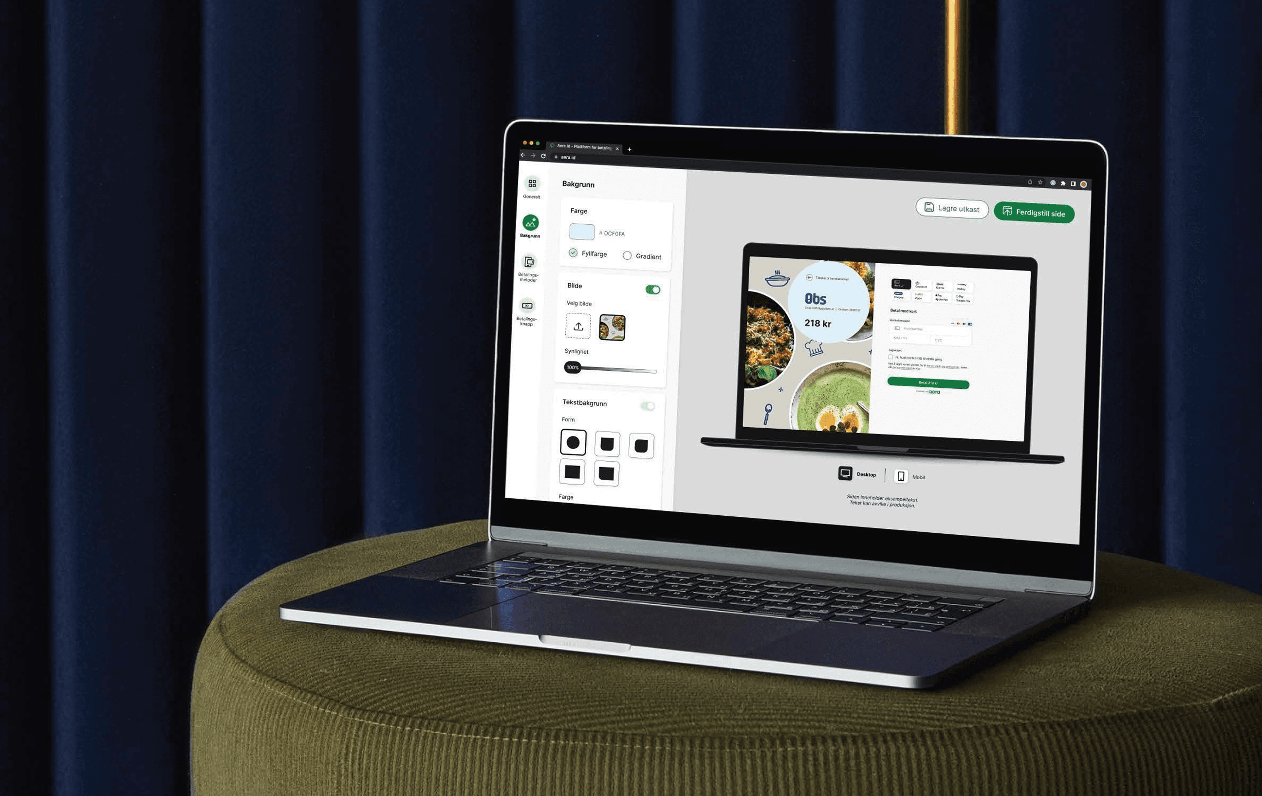
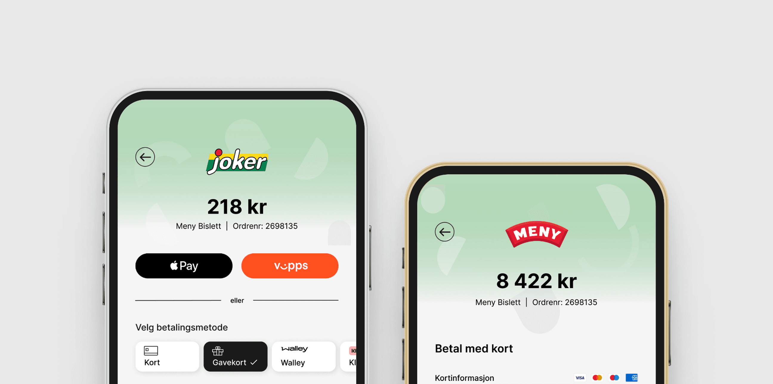
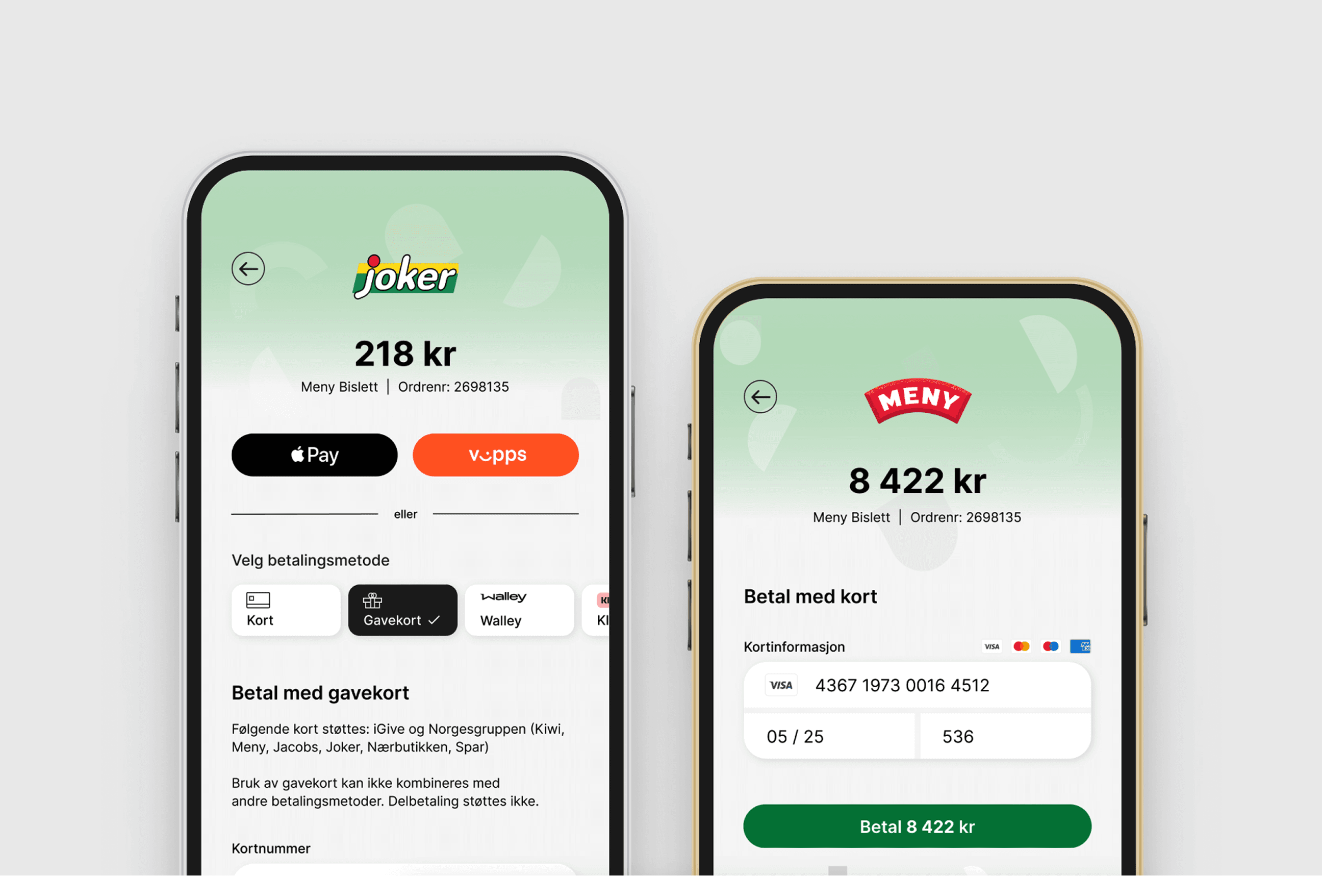
The solution delivered consisted of two template types: a standard template with neutral branding, and a customisable template where merchants could adjust things like logo, colours and background themselves via a dedicated configuration tool. Both templates delivered a consistent, simple and modern user experience, optimised for both web and mobile. The design supported different payment methods and was scalable for future needs. The solution also enabled a seamless, tailored UX across channels and merchants.